Cartographer
Cartographer is a project that I started after becoming interested in the marketing aspects of a business, particularly in regards to Key Opinion Leaders, Community Leaders, and Influencers. A big portion of marketing nowadays is related to identifying and marketing through these individuals as opposed to things like ads. However, when I inquired about a quantitative method of identifying people like this at my work, it became apparent that much of this is still manually done. Rather than any quantitative approach, it more boiled down into a networking exercise rather then an analytical one.
Seeing this as a potential avenue for improvement, or even just an alternative way to do things, this project was born. The goal of this project was to explore quantitative methods for finding Key Opinion Leaders, map their influence across a topic space, and granularly explore a certain KOL's sphere of influence. These methods could then be hopefully translated into a tool that marketing and market research analysts could then use. You can find the script files I used for this project here.
Starting Out
The first challenge was to figure out what exactly to measure. Influence is a fickle and weird thing to measure. Many methods are very manual, such as sending out surveys to a representative sample. In social media contexts, raw numbers are often used as a substitute, the more followers you have, the more influence you have. However, that ran against what I wanted to build. I wanted granular analysis, not just reducing people down to a metric. Besides, my initial research into this already revealed that something like this existed, the h-index. The h-index can be understood as a measure of how many citations an author received relative to how many articles they published. And it was here that an idea struck me. I could implement all the citation relations into a graph database, with each citation representing a link and each publication a node. Then, I could do what Google does with their webpages, and use PageRank (or another centrality algorithm) to find which articles have the highest weights. The higher the weight, the more central, and therefore the more important and influential the author is. As an added bonus, the graph database would allow me to look for things like pathing, community grouping, etc.
Pulling Data
The first major effort was pulling data to construct the relational database. My initial thought was to try pulling data from google scholar, since they looked like to had the most comprehensive listing of publications. But here I ran into my first problem, namely that the data I was looking for wasn't always available. Google Scholar had no available API, so I had to resort to writing a Selenium Webdriver script to scrape the website. But Google was very aggressive in weeding out scraping scripts. I tried several solutions to evade this, including having the script randomly perform actions, and routing the connection through TOR, but I ultimately concluded that it wasn't worth the time and effort I was putting in. I was spending more time fighting Google then actually building the database. I decided to cut my losses and went looking for other solutions instead. I published the script here for records purposes.
This turned out to be the correct decision, as more searching revealed the presence of data sources with API's, namely Pubmed and Crossref. Both had API's that importantly not only listed an article's references, but also citations from other articles. I was able to use those API's to write a script to pull articles. I initially structured to script to pull recursively from a single "seed" article, that is it would pull the seed's citations and references, and then use those pull their own citations and references, and so on and so forth. However, I quickly discovered it was a lot easier to just use Pubmed's term search function simulating a keyword search to pull an entire list first and go from there. To start out, I used the keyword "Urology", since I was already familiar with the space from work and could use that as sort of a validation that I was pulling relevant articles. I quickly discovered that within one recursion, I was already starting to get non-urology related articles, and the number of articles was also starting to increase exponentially, so I cut if off. The final article count pulled for the initial test case was approximately 100k.
Creating the Graph Database
For creating the graph relation database, I went with using Neo4j. Neo4j was my first introduction to graph relation databases, and rather than try and re-learn an entirely different system, I decided to go with what I was familiar with. Setup of the database was quite simple, with nodes created for authors, publications, and journals. I also made the decision to use separate nodes for associated keywords and the publication type, rather than just implementing it as a property of the node. Citations would be represented by a directional relation between the cited article and the citing article. I explored certain methods of weighting the citation, but ultimately decided to keep it simple for now.
Almost all of my Neo4j knowledge and general database knowledge is self-taught, so I often realize various improvements while I'm in the process of building, or realize that implementing certain features are vital to performance. One of those features was to implement indexing on the unique keys in the database to dramatically speed up the process of creating relationships. The other improvement was me discovering a better way to load in large amounts of data using the Load CSV command. I had previously written it as an insertion script in Python, Load CSV allowed me to reduce that down to a few lines of Cypher. This reduced many lines of code down to a few lines of Cypher, and helped greatly simplify the process. You can see some of the cypher queries I wrote here.
Since I had intended this as a prototype run, I implemented certain preprocessing/data cleaning steps but skipped others in the interest of time. This ultimately came down to a prioritization effort. Some were relatively easy to do, some required a lot more effort. There was also differing importance. Some would be vital to this prototype, others were more nice-to-have. The main cleaning step I did was to combine author names together where I could, ie combining "John H Harvey" with "John Harvey" This was challenging enough, because author names were not always presented in the same format. Some used full first name, last name, some had middle initials, some abbreviated the first name, etc. I implemented the most basic clean, combining if their first and last names matched. This took care of most of authors, but for those with abbreviated first names, which would require a more detailed disambiguation effort, I skipped for now. Some further research showed that this is apparently a major issue, with some major research effort using ML put into it. I made a note to myself to come back to this later. Date disambiguation was relatively straightforward to do, but I purposefully deprioritized it for the prototype effort. While it was relatively simple, there was a wide variety of date formats used with varying levels of precision, some going down to the exact day, some just had a year. Looking at graph changes over a time series was something that I was interested in, but I thought that it was more important to get the basic graph db structure implemented to test it out. Time series analysis could be done later. The final piece of cleaning that could have been done was address/institution disambiguation. I had originally intended to use this to allow association of influence with certain hospitals, universities, etc. However, this turned out to be far more difficult than anticipated. Just like authors and dates, there was a wide variety of formats and precision that were detailed. In one case, I had an article with three authors, and despite all belonging to the same institution, listed the institution three different ways. This became nightmare to disambiguate. I explored some different methods of doing so, including by looking at things like cosine similarity between the different listed institutions, and combining them if they met a threshold, but there was no method that consistently worked for all edge cases. Given the rickety state of this, I ultimately decided to skip it for the prototype phase. I really wanted to implement this though, and this is probably one of the first additional feature that I would want to go back and work on.
Analytics
After the database prototype was set up, next came time to run analysis and use the database. This was probably the most exciting moment for me. I had started this project partially because I was excited for the possibilities of analysis afforded by a graph database. Now, with the prototype database set up, I could dive in.
In programming terms, this was relatively straightforward, mainly consisting of creating different queries in Cypher, the query language that Neo4j uses. The first effort consisted of running PageRank on the graph, which could be done using the Graph Data Science librarys that came with Neo4j. The second consisted of creating pre-set cypher queries that could be used, i.e. find all articles by a single author related to a certain topic. You can see the queries here.
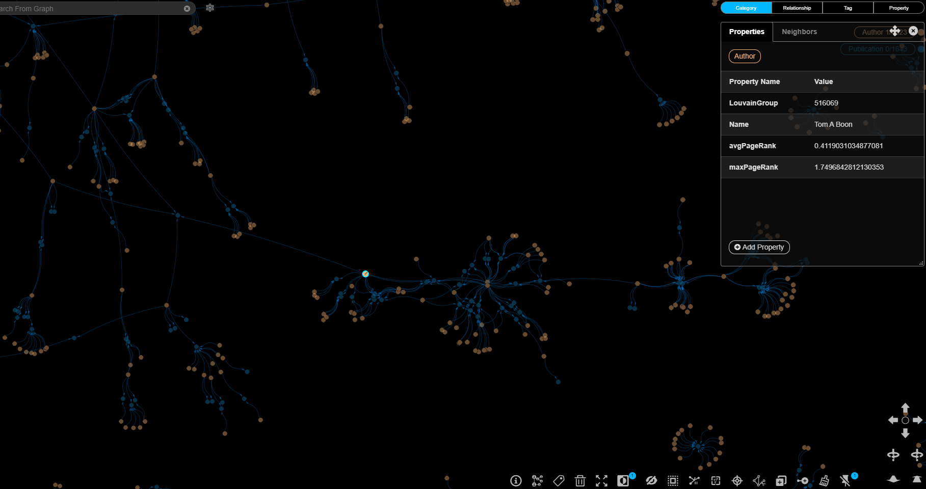
To better simulate a use case, I approached from the perspective of an analyst tasked with putting together a profile of an author.
I purposely chose one that we already worked with at my day job, since this would allow me to validate my findings.
Here the graph allowed for some interesting analysis that would be a lot more difficult to do otherwise.
The first was looking at the collaboration graph.
This let me see not only just who collaborated with who, but also allowed for identifying communities around the author.
The graph also allowed me to more easily analyze influence: who an author cited, who cited them, and on what topics.
You can see the final report that I put together at the Google Drive link below:
Sample Author Profile
While working on the product, it also gave me a chance to catalogue other analyses that I would want to work on in the future to take full advantage of the graph network. I was eager to dive deeper during the making of the Sample Author Profile, but I was also wary of going too overboard. I didn't wan't to get into a situation where I never finished because I just kept finding more "cool" things to play with. So I made the concious decision to give myself a time limit of a few days, and to make note of the other potential analyses I wanted to do but couldn't. I go over some of them below.
The first was I wanted to take a look at other centrality measures as well.
PageRank was useful to see where influence converged, but other measures, like Betweeness Centrality, held value as well.
For example, suppose you are trying to find a “bridging” author like the one below, one that is involved in two different communities that don't often interact with each other, and can act as a connector.
 This could be for a number of reasons, i.e., you are trying to expand your reach into a different community and need a toehold using their personal introduction.
The graph network would allow you do to do so, by measuring and looking for high betweenness centrality.
This could be for a number of reasons, i.e., you are trying to expand your reach into a different community and need a toehold using their personal introduction.
The graph network would allow you do to do so, by measuring and looking for high betweenness centrality.
Another was more advanced community detection.
Basic community detection could already be done just by observation of the graph network.
For example, below you can see the graph of an author's publications, and all co-authors they worked with for those publications.
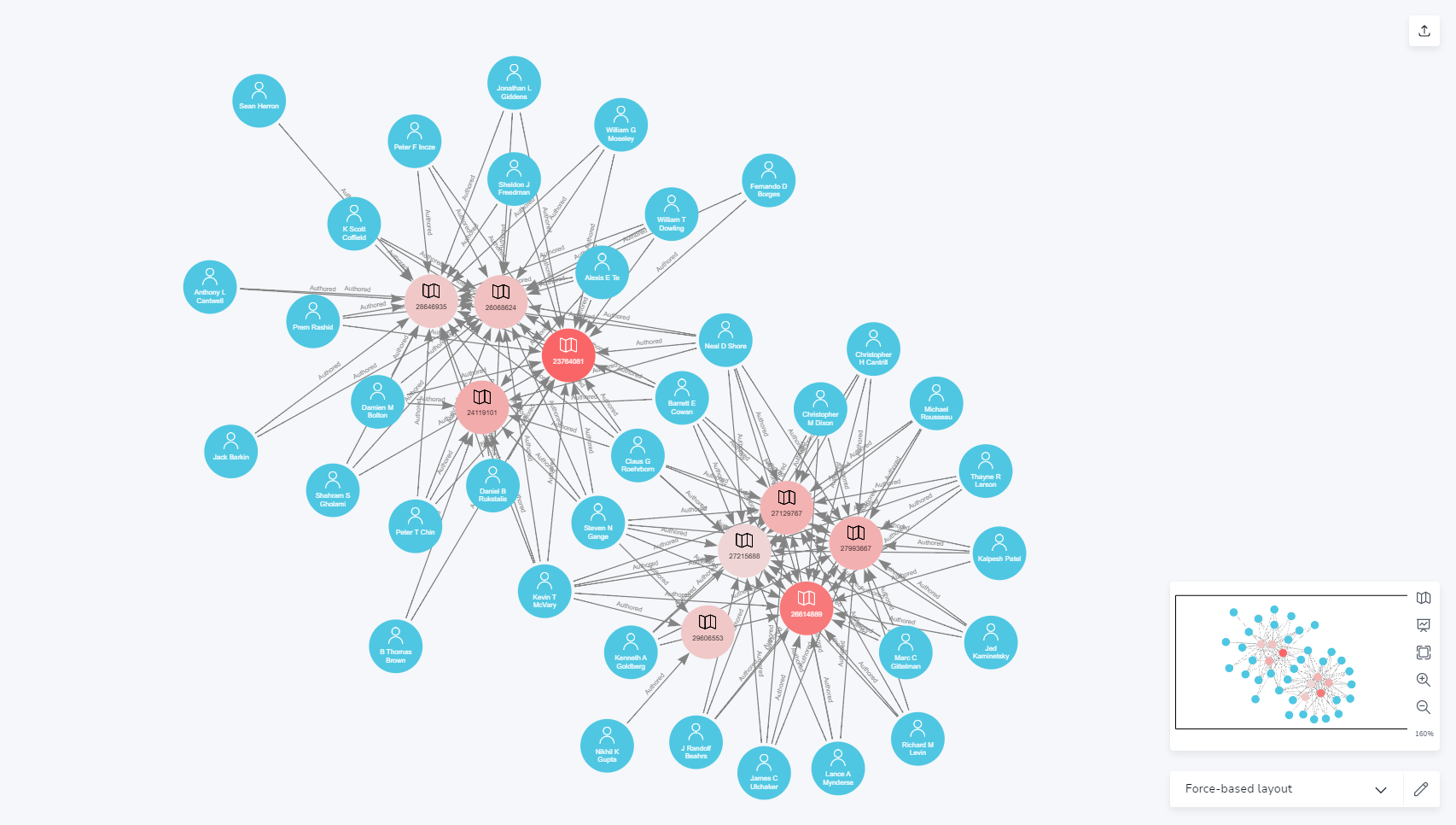 You can easily see that this author's collaborators fall into two distinct categories, each associated with a cluster of articles.
An analyst would easily be able to follow up on this to discern where this author's primary interests lie.
You can easily see that this author's collaborators fall into two distinct categories, each associated with a cluster of articles.
An analyst would easily be able to follow up on this to discern where this author's primary interests lie.
This same analysis can also be applied to get the “lay of the land” of a topic space.
Below shows the graph network structure where all publications related to "Laser Therapy", and then their authors, were pulled.
Each author node is blue, while publication nodes are red.
Publication nodes are also color scaled relatively, with full red being highest PageRank weight, and lowest being a faint red(almost invisible in this case)
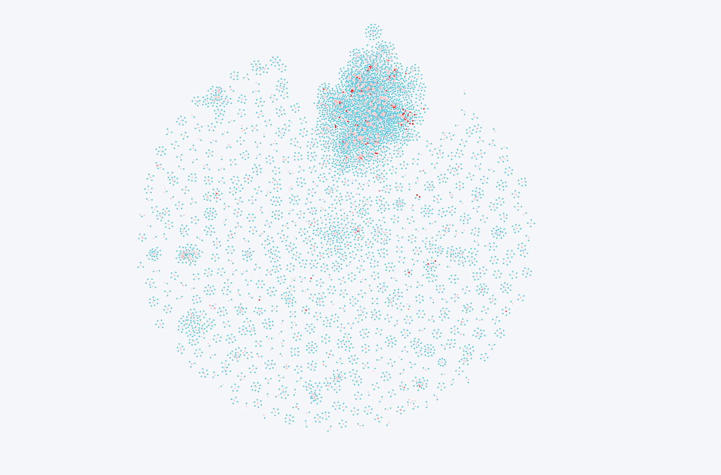 You can easily see the large “collaboration community” in the top center, where a lot of representing authors that often work together.
You can also see through the color scaling that this cluster also encompasses almost all the dark red nodes indicating high PageRank weight.
An analyst could then conclude this group is the highly involved in publishing, highly cited, and highly respected community of this topic.
If you wanted to develop a new product in this space, these would be the community you would want to get into.
You can easily see the large “collaboration community” in the top center, where a lot of representing authors that often work together.
You can also see through the color scaling that this cluster also encompasses almost all the dark red nodes indicating high PageRank weight.
An analyst could then conclude this group is the highly involved in publishing, highly cited, and highly respected community of this topic.
If you wanted to develop a new product in this space, these would be the community you would want to get into.
In addition to just observing the graph, more sophisticated methods such as the Louvain Method could be implemented as well. These groupings could then be analyzed and compared to the graph structure, and also sliced by topic/keyword.
Finally, I wanted to take advantage of the graph network to do path finding.
You can see an example of this below, with the graph instructed to find the shortest path between two authors.
 My first ideas would be to take advantage of path finding algorithms to find the shortest path between two authors.
This could be used in a number of ways.
One example could be if you had a “target” author you were trying to influence.
You could then find the shortest path between an author already favorable to you and the target, and use it to map out how to bring them on board, by common topic, people, etc.
The other potential analysis would be to map the closest paths between publications, in order to see how their associated keywords/topics are related to each other.
My first ideas would be to take advantage of path finding algorithms to find the shortest path between two authors.
This could be used in a number of ways.
One example could be if you had a “target” author you were trying to influence.
You could then find the shortest path between an author already favorable to you and the target, and use it to map out how to bring them on board, by common topic, people, etc.
The other potential analysis would be to map the closest paths between publications, in order to see how their associated keywords/topics are related to each other.
Many of these ideas were straightforward to implement, and I hope to be able to create a more advanced analytical product showing off the graph database's capability.
Feedback and Future Improvements
After finishing up the prototype and a sample product, I looked to try and get validation on my idea from marketing professionals I knew.
Overall, the feedback was positive, with them remarking that they could see the value-add in the tool. Particularly, they remarked that it would allow for a more analytical and quantitative method of going about doing their market research, particularly where it would usually be a networking exercise. They also mentioned it would also be a useful tool when planning and executing a publication strategy.
There were however improvements and limitations that they mentioned, that I took to heart, and am planning improvements for.
The first issue was that scientific research publications are often not the main focus in Marketing. Much more commonly used are things like syndicated reports talking about market trends, pricing and financials info, and mergers and acquisitions news. In hindsight, this makes sense because a lot of marketing activity can be boiled down to looking for new opportunities. Cartographer's focus on a person's influence means that it does not contribute as much there.
The other limitation is on when the tool could be useful. Talking with professionals, there would be two useful periods of time. The first is early on, when a team needs to get the lay of the land they are working in. The second is later on when the project is scaled up, and when there are enough marketing resources, like a full department, to spare to do precision targeting of publications and physicians. This meant that there was a "middle" point, where Cartographer wouldn't be as useful.
However, this gave me new ideas on improvements that I could make that could allow it to be helpful in this regard.
To address the first limitation, I would expand the articles used beyond just scientific publications. This would be the most straightforward improvement, though the most technically challenging, particularly from a data collection standpoint. A dedicated web crawler would have to be created, that constantly looked for new articles, reports, etc. in a desired topic space, which would then feed into the database. Citation links would be replaced instead by topic references. Analysis would focus less on authors, and more on topics, i.e. which terms are showing up more.
The other improvements would be from an analytical perspective, which would help address the two limitations. The date cleaning that I skipped would have to be implemented, to allow for the graph to be observed from a time series perspective. This would allow an analyst to watch how the graph changes over time, including what topics are seeing more interest. Combining this with slicing the graph by keywords, and term mentions in the abstracts, would allow for modeling of interest over time. Better organization and cleaning of keywords and topics, including better preprocessing like lemmatization would also be implemented. The graph structure would also allow better analysis of how ideas spread: looking for originators of ideas, and looking at how they spread between authors.
These changes would ultimately allow an analyst to easily pick up on new trends, or analyze historical ones to gain insight on how the market might change, or neglected spaces. This would be useful no matter where in the life cycle of the project.
Ultimately, I hope to implement the improvements to address the feedback and improve Cartographer.